

Hi Everybody! I have a colorful evening planned for your pleasure! Your photostudy tonight is from my gallery featuring warm colors in Nature.
Next, is some great information from our favorite Wikipedia Site, on what Color Is. You are welcome to scan it or skip it (no tests ever)!
Then a big Surprise! I have a Guest Artist who agreed to show us some of his wonderful work and his great use of Color. His name is Gari Hatch. He is one of our friends of this blog community we are creating here! I encourage you to visit his gallery on G+.
Enjoy your colorful adventure and add some Color to Your World!

Hummingbird in Hurricane
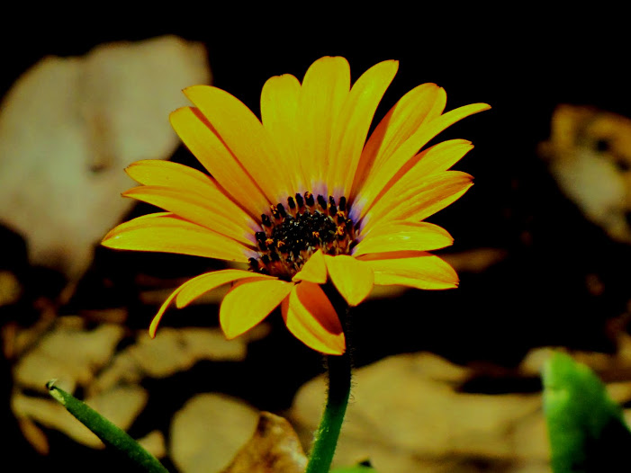
Gold Daylily

Country Corner

Scissor-tailed Flycatcher on Fence

Scissor-tailedFlycatcher, cow in sunset

Cows in golden sunset

My Favorite-The Sun

Cows do not watch the sunset

Big Sky Country

A Texas Sunset

Warm Golden Colors

A wonderful peaceful place-only cows-no people as far as I can see
wildflower

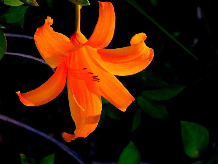
Red Daylily

Home on the Range

Rainbow over Rainbow Creek
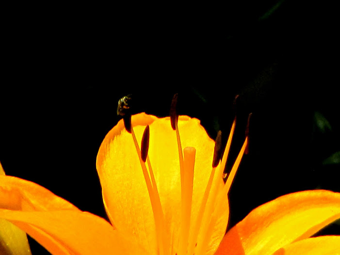
orange daylily

Sending You All Love From Texas!
Just Push Play
Color
From Wikipedia, the free encyclopedia
Color or colour (see spelling differences) is the visual perceptual propertycorresponding in humans to the categories called red, green, blue, and others. Color derives from the spectrum of light (distribution of light power versuswavelength) interacting in the eye with the spectral sensitivities of the light receptors. Color categories and physical specifications of color are also associated with objects, materials, light sources, etc., based on their physical properties such as light absorption, reflection, or emission spectra. By defining a color space, colors can be identified numerically by their coordinates.
Because perception of color stems from the varying spectral sensitivity of different types of cone cells in the retina to different parts of the spectrum, colors may be defined and quantified by the degree to which they stimulate these cells. These physical or physiological quantifications of color, however, do not fully explain the psychophysical perception of color appearance.
The science of color is sometimes called chromatics, chromatography, colorimetry, or simply color science. It includes the perception of color by the human eye and brain, the origin of color in materials, color theory in art, and the physics of electromagnetic radiation in the visible range (that is, what we commonly refer to simply as light).
Physics
| color | wavelength interval | frequency interval |
|---|---|---|
| red | ~ 700–635 nm | ~ 430–480 THz |
| orange | ~ 635–590 nm | ~ 480–510 THz |
| yellow | ~ 590–560 nm | ~ 510–540 THz |
| green | ~ 560–490 nm | ~ 540–610 THz |
| blue | ~ 490–450 nm | ~ 610–670 THz |
| violet | ~ 450–400 nm | ~ 670–750 THz |
| Color | 
(nm)
| 
(THz)
| 
(μm−1)
| 
(eV)
|
(kJ mol−1)
|
|---|---|---|---|---|---|
| Infrared | >1000 | <300 | <1.00 | <1.24 | <120 |
| Red | 700 | 428 | 1.43 | 1.77 | 171 |
| Orange | 620 | 484 | 1.61 | 2.00 | 193 |
| Yellow | 580 | 517 | 1.72 | 2.14 | 206 |
| Green | 530 | 566 | 1.89 | 2.34 | 226 |
| Blue | 470 | 638 | 2.13 | 2.64 | 254 |
| Violet | 420 | 714 | 2.38 | 2.95 | 285 |
| Near ultraviolet | 300 | 1000 | 3.33 | 4.15 | 400 |
| Far ultraviolet | <200 | >1500 | >5.00 | >6.20 | >598 |
Electromagnetic radiation is characterized by its wavelength(or frequency) and its intensity. When the wavelength is within the visible spectrum (the range of wavelengths humans can perceive, approximately from 390 nm to 750 nm), it is known as "visible light".
Most light sources emit light at many different wavelengths; a source's spectrum is a distribution giving its intensity at each wavelength. Although the spectrum of light arriving at the eye from a given direction determines the color sensation in that direction, there are many more possible spectral combinations than color sensations. In fact, one may formally define a color as a class of spectra that give rise to the same color sensation, although such classes would vary widely among different species, and to a lesser extent among individuals within the same species. In each such class the members are calledmetamers of the color in question.
[edit]Spectral colors
The familiar colors of the rainbow in the spectrum – named using the Latin word for appearance or apparition by Isaac Newton in 1671 – include all those colors that can be produced by visible light of a single wavelength only, the pure spectral ormonochromatic colors. The table at right shows approximate frequencies (in terahertz) and wavelengths (in nanometers) for various pure spectral colors. The wavelengths are measured in air or vacuum (see refraction).
The color table should not be interpreted as a definitive list – the pure spectral colors form a continuous spectrum, and how it is divided into distinct colors linguistically is a matter of culture and historical contingency (although people everywhere have been shown to perceive colors in the same way[2]). A common list identifies six main bands: red, orange, yellow, green, blue, and violet. Newton's conception included a seventh color, indigo, between blue and violet. Optical scientists Hardy and Perrin list indigo as between 446 and 464 nm wavelength.[3]
The intensity of a spectral color, relative to the context in which it is viewed, may alter its perception considerably; for example, a low-intensity orange-yellow is brown, and a low-intensity yellow-green is olive-green.
For discussion of non-spectral colors, see below.
[edit]Color of objects
The color of an object depends on both the physics of the object in its environment and the characteristics of the perceiving eye and brain. Physically, objects can be said to have the color of the light leaving their surfaces, which normally depends on the spectrum of the incident illumination and the reflectance properties of the surface, as well as potentially on the angles of illumination and viewing. Some objects not only reflect light, but also transmit light or emit light themselves (see below), which contribute to the color also. And a viewer's perception of the object's color depends not only on the spectrum of the light leaving its surface, but also on a host of contextual cues, so that the color tends to be perceived as relatively constant: that is, relatively independent of the lighting spectrum, viewing angle, etc. This effect is known as color constancy.

Some generalizations of the physics can be drawn, neglecting perceptual effects for now:
- Light arriving at an opaque surface is either reflected "specularly" (that is, in the manner of a mirror), scattered (that is, reflected with diffuse scattering), or absorbed– or some combination of these.
- Opaque objects that do not reflect specularly (which tend to have rough surfaces) have their color determined by which wavelengths of light they scatter more and which they scatter less (with the light that is not scattered being absorbed). If objects scatter all wavelengths, they appear white. If they absorb all wavelengths, they appear black.
- Opaque objects that specularly reflect light of different wavelengths with different efficiencies look like mirrors tinted with colors determined by those differences. An object that reflects some fraction of impinging light and absorbs the rest may look black but also be faintly reflective; examples are black objects coated with layers of enamel or lacquer.
- Objects that transmit light are either translucent (scattering the transmitted light) ortransparent (not scattering the transmitted light). If they also absorb (or reflect) light of various wavelengths differentially, they appear tinted with a color determined by the nature of that absorption (or that reflectance).
- Objects may emit light that they generate themselves, rather than merely reflecting or transmitting light. They may do so because of their elevated temperature (they are then said to be incandescent), as a result of certain chemical reactions (a phenomenon calledchemoluminescence), or for other reasons (see the articles Phosphorescence and List of light sources).
- Objects may absorb light and then as a consequence emit light that has different properties. They are then called fluorescent (if light is emitted only while light is absorbed) or phosphorescent (if light is emitted even after light ceases to be absorbed; this term is also sometimes loosely applied to light emitted because of chemical reactions).
For further treatment of the color of objects, see structural color, below.
To summarize, the color of an object is a complex result of its surface properties, its transmission properties, and its emission properties, all of which factors contribute to the mix of wavelengths in the light leaving the surface of the object. The perceived color is then further conditioned by the nature of the ambient illumination, and by the color properties of other objects nearby, via the effect known as color constancy and via other characteristics of the perceiving eye and brain.
[edit]Perception

[edit]Development of theories of color vision
Main article: Color theory
Although Aristotle and other ancient scientists had already written on the nature of light and color vision, it was not until Newton that light was identified as the source of the color sensation. In 1810, Goethe published his comprehensive Theory of Colors in which he described the physiological effects of color.
In 1801 Thomas Young proposed his trichromatic theory, based on the observation that any color could be matched with a combination of three lights. This theory was later refined by James Clerk Maxwell and Hermann von Helmholtz. As Helmholtz puts it, "the principles of Newton's law of mixture were experimentally confirmed by Maxwell in 1856. Young's theory of color sensations, like so much else that this marvellous investigator achieved in advance of his time, remained unnoticed until Maxwell directed attention to it."[4]
At the same time as Helmholtz, Ewald Hering developed the opponent process theory of color, noting that color blindness and afterimages typically come in opponent pairs (red-green, blue-orange, yellow-purple, and black-white). Ultimately these two theories were synthesized in 1957 by Hurvich and Jameson, who showed that retinal processing corresponds to the trichromatic theory, while processing at the level of the lateral geniculate nucleus corresponds to the opponent theory.[5]
In 1931, an international group of experts known as the Commission internationale de l'éclairage (CIE) developed a mathematical color model, which mapped out the space of observable colors and assigned a set of three numbers to each.
[edit]Color in the eye
Main article: Color vision

The ability of the human eye to distinguish colors is based upon the varying sensitivity of different cells in the retina to light of different wavelengths. Humans being trichromatic, the retina contains three types of color receptor cells, or cones. One type, relatively distinct from the other two, is most responsive to light that we perceive as violet, with wavelengths around 420 nm; cones of this type are sometimes called short-wavelength cones, S cones, or blue cones. The other two types are closely related genetically and chemically. One of them, sometimes called long-wavelength cones, L cones, or red cones, is most sensitive to light we perceive as greenish yellow, with wavelengths around 564 nm; the other type, known asmiddle-wavelength cones, M cones, or green cones is most sensitive to light perceived as green, with wavelengths around 534 nm.
Light, no matter how complex its composition of wavelengths, is reduced to three color components by the eye. For each location in the visual field, the three types of cones yield three signals based on the extent to which each is stimulated. These amounts of stimulation are sometimes called tristimulus values.
The response curve as a function of wavelength for each type of cone is illustrated above. Because the curves overlap, some tristimulus values do not occur for any incoming light combination. For example, it is not possible to stimulate only the mid-wavelength (so-called "green") cones; the other cones will inevitably be stimulated to some degree at the same time. The set of all possible tristimulus values determines the human color space. It has been estimated that humans can distinguish roughly 10 million different colors.[6]
The other type of light-sensitive cell in the eye, the rod, has a different response curve. In normal situations, when light is bright enough to strongly stimulate the cones, rods play virtually no role in vision at all.[7] On the other hand, in dim light, the cones are understimulated leaving only the signal from the rods, resulting in a colorless response. (Furthermore, the rods are barely sensitive to light in the "red" range.) In certain conditions of intermediate illumination, the rod response and a weak cone response can together result in color discriminations not accounted for by cone responses alone. These effects, combined, are summarized also in the Kruithof curve, that describes the change of color perception and pleasingness of light as function of temperature and intensity.
[edit]Color in the brain
Main article: Color vision

While the mechanisms of color vision at the level of the retina are well-described in terms of tristimulus values (see above), color processing after that point is organized differently. A dominant theory of color vision proposes that color information is transmitted out of the eye by three opponent processes, or opponent channels, each constructed from the raw output of the cones: a red–green channel, a blue–yellow channel, and a black–white "luminance" channel. This theory has been supported by neurobiology, and accounts for the structure of our subjective color experience. Specifically, it explains why we cannot perceive a "reddish green" or "yellowish blue", and it predicts the color wheel: it is the collection of colors for which at least one of the two color channels measures a value at one of its extremes.
The exact nature of color perception beyond the processing already described, and indeed the status of color as a feature of the perceived world or rather as a feature of our perception of the world, is a matter of complex and continuing philosophical dispute (see qualia).
[edit]Nonstandard color perception
[edit]Color deficiency
Main article: Color blindness
If one or more types of a person's color-sensing cones are missing or less responsive than normal to incoming light, that person can distinguish fewer colors and is said to be color deficient or color blind (though this latter term can be misleading; almost all color deficient individuals can distinguish at least some colors). Some kinds of color deficiency are caused by anomalies in the number or nature of cones in the retina. Others (like central or cortical achromatopsia) are caused by neural anomalies in those parts of the brain where visual processing takes place.
[edit]Tetrachromacy
Main article: Tetrachromacy
While most humans are trichromatic (having three types of color receptors), many animals, known as tetrachromats, have four types. These include some species of spiders, most marsupials, birds, reptiles, and many species of fish. Other species are sensitive to only two axes of color or do not perceive color at all; these are called dichromats and monochromats respectively. A distinction is made between retinal tetrachromacy (having four pigments in cone cells in the retina, compared to three in trichromats) and functional tetrachromacy (having the ability to make enhanced color discriminations based on that retinal difference). As many as half of all women are retinal tetrachromats.[8]:p.256 The phenomenon arises when an individual receives two slightly different copies of the gene for either the medium- or long-wavelength cones, which are carried on the x-chromosome. To have two different genes, a person must have two x-chromosomes, which is why the phenomenon only occurs in women.[8] For some of these retinal tetrachromats, color discriminations are enhanced, making them functional tetrachromats.[8]
[edit]Synesthesia
In certain forms of synesthesia, perceiving letters and numbers (grapheme–color synesthesia) or hearing musical sounds (music–color synesthesia) will lead to the unusual additional experiences of seeing colors. Behavioral and functional neuroimaging experiments have demonstrated that these color experiences lead to changes in behavioral tasks and lead to increased activation of brain regions involved in color perception, thus demonstrating their reality, and similarity to real color percepts, albeit evoked through a non-standard route.
[edit]Afterimages

After exposure to strong light in their sensitivity range, photoreceptors of a given type become desensitized. For a few seconds after the light ceases, they will continue to signal less strongly than they otherwise would. Colors observed during that period will appear to lack the color component detected by the desensitized photoreceptors. This effect is responsible for the phenomenon of afterimages, in which the eye may continue to see a bright figure after looking away from it, but in a complementary color.
Afterimage effects have also been utilized by artists, including Vincent van Gogh.
[edit]Color constancy
Main article: Color constancy
There is an interesting phenomenon which occurs when an artist uses a limited color palette: the eye tends to compensate by seeing any gray or neutral color as the color which is missing from the color wheel. For example, in a limited palette consisting of red, yellow, black, and white, a mixture of yellow and black will appear as a variety of green, a mixture of red and black will appear as a variety of purple, and pure gray will appear bluish.[9]
The trichromatic theory discussed above is strictly true when the visual system is in a fixed state of adaptation. In reality, the visual system is constantly adapting to changes in the environment and compares the various colors in a scene to reduce the effects of the illumination. If a scene is illuminated with one light, and then with another, as long as the difference between the light sources stays within a reasonable range, the colors in the scene appear relatively constant to us. This was studied by Edwin Land in the 1970s and led to his retinex theory of color constancy.
It should be noted, that both phenomena described above are readily explained and mathematical modeled with modern theories of chromatic adaptation and color appearance (e.g. CIECAM02, iCAM).[10] There is no need to dismiss the trichromatic theory of vision, but rather it must be enhanced with an understanding of how the visual system adapts (adjusts) to changes in the viewing environment.
[edit]Color naming
Main article: Color term
Colors vary in several different ways, including hue (shades of red, orange, yellow, green, blue, and violet), saturation, brightness, andgloss. Some color words are derived from the name of an object of that color, such as "orange" or "salmon", while others are abstract, like "red".
In the 1969 study Basic Color Terms: Their Universality and Evolution, Brent Berlin and Paul Kay describe a pattern in naming "basic" colors (like "red" but not "red-orange" or "dark red" or "blood red", which are "shades" of red). All languages that have two "basic" color names distinguish dark/cool colors from bright/warm colors. The next colors to be distinguished are usually red and then yellow or green. All languages with six "basic" colors include black, white, red, green, blue, and yellow. The pattern holds up to a set of twelve: black, gray, white, pink, red, orange, yellow, green, blue, purple, brown, and azure (distinct from blue in Russian and Italian, but not English).
[edit]Associations
Individual colors have a variety of cultural associations such as national colors (in general described in individual color articles and color symbolism). The field of color psychology attempts to identify the effects of color on human emotion and activity. Chromotherapy is a form of alternative medicine attributed to various Eastern traditions. Colors have different associations in different countries and cultures.[11]
Different colors have been demonstrated to have effects on cognition. For example, researchers at the University of Linz in Austria demonstrated that the color red significantly decreases cognitive functioning in men.[12]
[edit]Spectral colors and color reproduction

Most light sources are mixtures of various wavelengths of light. Many such sources can still effectively produce a spectral color, as the eye cannot distinguish them from single-wavelength sources. For example, most computer displays reproduce the spectral color orange as a combination of red and green light; it appears orange because the red and green are mixed in the right proportions to allow the eye's cones to respond the way they do to the spectral color orange.
A useful concept in understanding the perceived color of a non-monochromatic light source is thedominant wavelength, which identifies the single wavelength of light that produces a sensation most similar to the light source. Dominant wavelength is roughly akin to hue.
There are many color perceptions that by definition cannot be pure spectral colors due to desaturationor because they are purples (mixtures of red and violet light, from opposite ends of the spectrum). Some examples of necessarily non-spectral colors are the achromatic colors (black, gray, and white) and colors such as pink, tan, and magenta.
Two different light spectra that have the same effect on the three color receptors in the human eye will be perceived as the same color. They are metamers of that color. This is exemplified by the white light emitted by fluorescent lamps, which typically has a spectrum of a few narrow bands, while daylight has a continuous spectrum. The human eye cannot tell the difference between such light spectra just by looking into the light source, although reflected colors from objects can look different. (This is often exploited; for example, to make fruit or tomatoes look more intensely red.)
Similarly, most human color perceptions can be generated by a mixture of three colors calledprimaries. This is used to reproduce color scenes in photography, printing, television, and other media. There are a number of methods or color spaces for specifying a color in terms of three particular primary colors. Each method has its advantages and disadvantages depending on the particular application.
No mixture of colors, however, can produce a fully pure color perceived as completely identical to a spectral color, although one can get very close for the longer wavelengths, where the chromaticity diagram above has a nearly straight edge. For example, mixing green light (530 nm) and blue light (460 nm) produces cyan light that is slightly desaturated, because response of the red color receptor would be greater to the green and blue light in the mixture than it would be to a pure cyan light at 485 nm that has the same intensity as the mixture of blue and green.
Because of this, and because the primaries in color printing systems generally are not pure themselves, the colors reproduced are never perfectly saturated colors, and so spectral colors cannot be matched exactly. However, natural scenes rarely contain fully saturated colors, thus such scenes can usually be approximated well by these systems. The range of colors that can be reproduced with a given color reproduction system is called the gamut. The CIE chromaticity diagram can be used to describe the gamut.
Another problem with color reproduction systems is connected with the acquisition devices, like cameras or scanners. The characteristics of the color sensors in the devices are often very far from the characteristics of the receptors in the human eye. In effect, acquisition of colors that have some special, often very "jagged", spectra caused for example by unusual lighting of the photographed scene can be relatively poor.
Species that have color receptors different from humans – such as bird species, which may have four receptors – can make color discriminations that humans cannot. A color reproduction system "tuned" to a human with normal color vision may give very inaccurate results for the other observers, human or non-human.
The different color response of different devices can be problematic if not properly managed. For color information stored and transferred in digital form, color management techniques, such as those based on ICC profiles, can help to avoid distortions of the reproduced colors. Color management does not circumvent the gamut limitations of particular output devices, but can assist in finding good mapping of input colors into the gamut that can be reproduced.
[edit]Pigments and reflective media
Main article: Pigment
Pigments are chemicals that selectively absorb and reflect different spectra of light. When a surface is painted with a pigment, light hitting the surface is reflected, minus some wavelengths. This subtraction of wavelengths produces the appearance of different colors. Most paints are a blend of several chemical pigments, intended to produce a reflection of a given color.
Pigment manufacturers assume the source light will be white, or of roughly equal intensity across the spectrum. If the light is not a pure white source (as in the case of nearly all forms of artificial lighting), the resulting spectrum will appear a slightly different color. Red paint, viewed under blue light, may appear black. Red paint is red because it reflects only the red components of the spectrum. Blue light, containing none of these, will create no reflection from red paint, creating the appearance of black.
[edit]Structural color
Further information: Structural coloration and Animal coloration
Structural colors are colors caused by interference effects rather than by pigments. Color effects are produced when a material is scored with fine parallel lines, formed of one or more parallel thin layers, or otherwise composed of microstructures on the scale of the color'swavelength. If the microstructures are spaced randomly, light of shorter wavelengths will be scattered preferentially to produce Tyndall effect colors: the blue of the sky (Rayleigh scattering, caused by structures much smaller than the wavelength of light, in this case air molecules), the luster of opals, and the blue of human irises. If the microstructures are aligned in arrays, for example the array of pits in a CD, they behave as a diffraction grating: the grating reflects different wavelengths in different directions due to interference phenomena, separating mixed "white" light into light of different wavelengths. If the structure is one or more thin layers then it will reflect some wavelengths and transmit others, depending on the layers' thickness.
Structural color is studied in the field of thin-film optics. A layman's term that describes particularly the most ordered or the most changeable structural colors is iridescence. Structural color is responsible for the blues and greens of the feathers of many birds (the blue jay, for example), as well as certain butterfly wings and beetle shells. Variations in the pattern's spacing often give rise to an iridescent effect, as seen in peacock feathers, soap bubbles, films of oil, and mother of pearl, because the reflected color depends upon the viewing angle. Numerous scientists have carried out research in butterfly wings and beetle shells, including Isaac Newton and Robert Hooke. Since 1942, electron micrography has been used, advancing the development of products that exploit structural color, such as "photonic" cosmetics.

https://plus.google.com/101626026703546245340/posts
Gari Hatch
5:08 PM - Public
Illuminated Abstract Painting:
Acrylic on art board,
Painted on: 11-26-2006
(Archival Collection)
Within
the forge,
smelt the gold,
along
the surface,
prick the ore.
Flotsam colors
begin to
float,
along the film
within
the hope.
Skim them
with
your ladle moves,
paint the glory
in
the grooves.
Illuminate
metallic
pool,
teach me how
to
use this tool.
Gari Hatch
07-23-2012
INTRODUCING GARI HATCH
LOOK WHAT HE DOES WITH COLOR, TEXTURE, COMPOSITION, EVERYTHING AND HIS VIDEOS!!!!! I AM AS PROUD OF HIM AS MY OWN CHILDREN. HE IS ON GOOGLE+ (LINKS BELOW).
ENJOY THIS BONUS TREAT!
Works at artist working on my own
Attended Vanguard University of Southern California
Lives in Morton, Mississippi
SPECIAL POST BY GARI

Gari Hatch
Jul 8, 2012 - Public
It has been an amazing day good friends. I went to the Mississippi Museum of Art this morning with my friend Beth Henry Paxton and I got to look at a lot of beautiful art before the worship service began and then Beth and I had lunch at Bravo Restaurant before we went to her business Staffers, Inc. in North Jackson and setup my art exhibit for this week and art reception on Thursday evening from 5 - 7pm. We put 57 of my paintings on the walls and I cannot tell you how good they looked in this suite of offices. Her business now looks like a gallery. Ha, ha!! We got all jazzed out and hours went by before we were through. I am psyched now.


HIS WORK:

https://plus.google.com/101626026703546245340/posts
Gari Hatch
Jul 14, 2012 (edited) - Public
Non-objective Painting:
Acrylic on art board,
Painted on: 04-05-2006,
Revised on: 07-14-2012
(Archival Collection)
Along
the copper seam
the splinter
pricks,
still,
it holds
the segments
thick.
Each
painted part,
each
piece that stays,
bind them where
the surface waits.
Gari Hatch
07-14-2012
Acrylic on art board,
Painted on: 04-05-2006,
Revised on: 07-14-2012
(Archival Collection)
Along
the copper seam
the splinter
pricks,
still,
it holds
the segments
thick.
Each
painted part,
each
piece that stays,
bind them where
the surface waits.
Gari Hatch
07-14-2012

https://plus.google.com/101626026703546245340/posts
Gari Hatch
Jul 19, 2012 - Public
Moth Collage Painting:
Real moth wing with acrylic on sculpted paper on art board
"Tremble My Spots"
If I had one flight on curtain green,
I would follow the pattern of this wing.
Then spread these markings for all to see,
oh, tremble my spots to catch the breeze.
Then to the light, I would rise and fly,
to live this night before I die.
Gari Hatch
04-13-2010

https://plus.google.com/101626026703546245340/posts
Gari Hatch
Jul 17, 2012 (edited) - Public
Moth Collage Painting:
11” x 14” in 15” x 19” shadowbox frame,
Acrylic on Catalpa branch with moss and lichen
& two pairs of yellow moth wings
"Yellow Moths"
When the light falls
where
moss grows,
yellow moths
rest
in
the glow.
Spots like eyes
flutter
wide,
then off again,
they
wing so high.
Tremble
where
the moonlight shines.
Gari Hatch
05-18-2011

Gari Hatch
Jul 15, 2012 (edited) - Public
Moth Collage Painting:
8" x 10" in 11" x 14" mat and frame under glass,
Three species of real moth wings &
Sycamore stem with acrylic on art board,
(Archival Collection)
"The Fluttered Wing"
Oh, the wings of the dead,
give them life once again.
Bond them to a broken branch,
watch them spread, as if to launch.
Everyday, I gather their broken parts,
resurrect their flight, this fragile start.
Oh, tremble me like the fluttered wing,
see me rise while my spirit sings.
Gari Hatch
07-31-2010

https://plus.google.com/101626026703546245340/posts
Gari Hatch
Jul 10, 2012 - Public
Illuminated Painting:
Acrylic on art board,
Painted on: 11-26-2005,
Revised on: 07-10-2012
(Archival Collection)
For what must
thread
and
feed the way,
for what can
branch
this
painted storm,
for what goes
through to
guide
the vine,
these things
we seek
and
learn to hide,
within
these depths
we
bide our time.
Gari Hatch
07-10-2012
Feature Presentation: New Video
Release by Gari Hatch!
Just Push Play
+++++++++++++++++++++++
Just Push Play
...this is brendasue signing off from Rainbow Creek. See You next time!
Peace be with YOU!
Just Push Play
Of course, one more great performance by Gari Hatch! Just Push Play
O+O
Brenda Sue,
ReplyDeleteIt is an amazing blog and you must have majored in photo journalism because you are so good at. Extensive research here and very impressive and thank you for inviting me to be a part of it. I applaud your work!
Gari
Hi Gari! Thanks for coming by and saying Hi to everybody! You are the shining star not me, but happy you like the presentation of your work! (I was a chef, just have a different menu now)! Research is all to the credit of Wikipedia! I just weave everything together for hopefully a pleasant experience! Love Ya and let us know about the Art Openings!b
Delete